10.10.2012

NEW WEBSITE

All,  I changed jobs recently, and in doing so needed to take stock of everything I'd done up to that point, get organized, and share it with the world!  Wordpress has some great templates and ease of use, so here it is!:

www.nickcurtis.wordpress.com

All future posts will be on the new website.

10.10.2010

3D Section

A 3-dimensional section I did as part of a competition effort for the San Diego Convention Center. Collaborated with Mr. Richard Farnan, Jason Essel, Scott Capstack, Todd Alchepohl and Jimmy Coldiron.


9.03.2010

San Jose Convention Center Proposal

Helped out our Convention Center Studio with these two renderings for a proposal. Worked with the excellent Mr. Wes Crosby and his vision. Beginning to see more and more beauty in Photoshop every day. Always trying out new techniques for entourage.


SF 49ers - Fundraiser Renderings

More renderings by yours truly. The designs I collaborated with Scott Capstack, our senior project designer, and Tambra and Alissa, in our interiors studio. Tyler and Austin, the extremely helpful interns at HNTB, assisted in adding people and touch-up in Photoshop for the top 3 images.


6.05.2010

49ers Stadium Atrium


A rendering I've been working on (with the help of many others) for a project at work. Night shot of a potential version of the atrium. Still waiting to see if the vote in Santa Clara, CA passes for a new football stadium for the 49ers.

2.03.2010

Bill's big question...


Showing a friend at work how easy Blogspot is. This is a hidden line rendering I did for a project at work.

1.31.2010

Page 01


Zac and All, Page 01, inked, no text yet. Actually looking forward to using my downloaded "ACTION COMICS" fonts. Still waiting to see if we use color or not.

1.20.2010

Vampire thingy story - Page 2


Zack and all, page 2 done being inked. Still gotta add text. Color, we'll see...

11.22.2009

Fear in the Fall of 2009


Saw this in a dream... really.

10.26.2009

THUMBNAILS

Thumbnails for a comic I'm working on with my friend/colleague Zack Thomas.

10.07.2009

Henchman

Sketch, ink.
With simple Photoshop color. Generally not liking digital color. Must return to more hand-rendered color.

Blueman


Sketch, ink, colored pencil, photoshop smudge.

9.09.2009

MEGAOPOLIS - Perspective Studies


Some sketches during break at work. Figuring out perspective, what works, what doesn't. I will say that the closer the vanishing point(s) get to the page, the tougher or more distorted the image seems to become. But maybe that could be a good thing in some situations?

Post-It Note Farmer


The title says it all.

7.09.2009

"Robot Man"


Penciled, Inked, and then colored in Photoshop. The "grass" brush in Photoshop rocks! Laid the colors down, then it was pretty much dodging and burning for shadows and highlights.

7.08.2009

Family Vacation

Did these up in a hurry for our meal out on the lake in Minnesota. MinneSOTa. OH YAH.

6.15.2009

Iron Man Sketch


Starting to play around with inking sketches now. Colored Iron Man and background sky in Photoshop. Honestly the sky wasn't as difficult as I thought it'd be. Photoshop has a number of specialty brushes that give more natural effects. And here I thought I'd have to find a ripped copy of Corel Painter to do this. Played around with a lense flare also.

5.08.2009

Shooter

A bit older sketch that I inked. Then, fun with markers. Did a lot of research and then decided on Copic Sketch markers. Two tips, one a wide (though not as wide as the standard Copic) and one a brush tip (very nice). Also still compatible with the Copic airbrush system which I haven't used for a finished sketch yet. This one still seems a little unfinished, but I got distracted and moved on.

1.25.2009

Venerable Vegetables


I believe every vegetable has it's own inherent personality.

Fairy


Another Sketch. This one I scanned and printed out on my inkjet printer (accidentally at low quality, hence the dots at the shaded areas) that I tried inking with a brush pen. Still have a lot to learn about head shape and the location of a woman's featers on her head. Must look at Andrew Loomis more.

Tiny Soldier with Big Heart

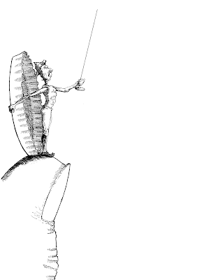
In researching old engraving and pen stroke techniques for a (losing) T-shirt design entry for Corporate Challenge (turns out bold, simple graphics look better on T-shirts, at least in the eyes of this committee), I tried finishing some other sketches (including this one) in the same manner. I'm always trying to get better at drawing people, and after drawing this soldier, I got fed up with always having to draw from my mind (as opposed to drawing from a reference), so I decided to put my thumb (which I could look at) under him and a beer bottle cap (not that one was lying around or anything) behind him. And that is how these two worlds of scale came to be in the same place.

Presenter


Like many drawings
I do, this one was an old pencil sketch, that I later came across and decided to take a little further. In this instance I had just been learning about brush pens (researching Michael Lark, artist for the Daredevil comic). This was one of my first attempts at using a brush pen. Fun!

9.21.2008

Super Office Man - Page 01 - no text, no color


Super Office Man, page 01.

Wanted to see what it was like to do a comic, so here is the beginning. No text or color yet. Took some inspiration from the office I work in for some of the images. I had been looking at Batman Black and White while I started this one. Don't know if I'll feel the need to add color or not. I will say that so far, comics do seem to take time. Laying out multiple pages, image sequencing and how that might go with the text, which points-of-view to use. And then inking, that seems to be a whole other thing in itself. I don't know, I may be too much of a slow mover/perfectionist to ever crank out comics with any kind of speed, but they are fun to explore for now.

8.09.2008

Save the Date

Illustrations for Wedding Save the Date cards last September. Pencil with Ink.

10.25.2007

The Little House that Could

Wendy's napkin sketch. Don't know why but I really like this one...

Spoiled Prince


Came across an old sketch and added some color in Photoshop.

9.26.2007

The Elbow by Theresa


Theresa, trying to describe where her elbow hurt after working out yesterday. A very effective drawing.

Aeroplane


Was watching a special on WWII Planes. Drawing on thick manila board kinda gave it the old paper look.